Logo and UI Design
VUGA chat was a very big learning experience for me. It was a very unique opportunity to work with an overseas tech-deficient country. Many design choices would have been deemed a mistake in well-known design countries. The client ultimately got what they wanted at the time but was left with a failed attempt at an app. The client and my manager decided they would part ways.
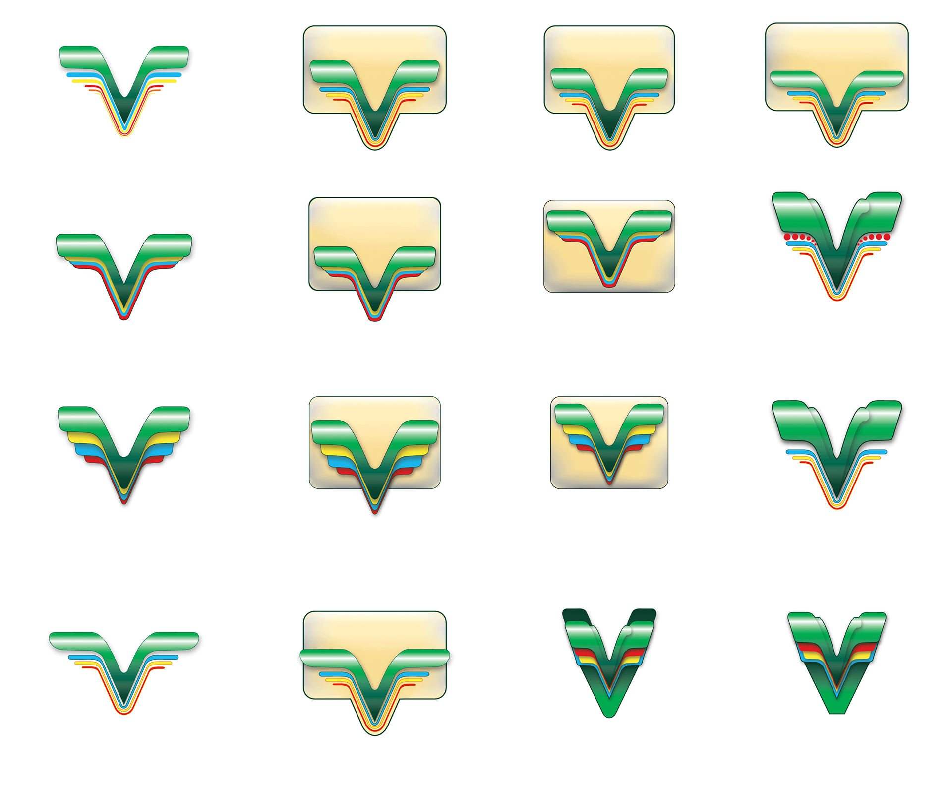
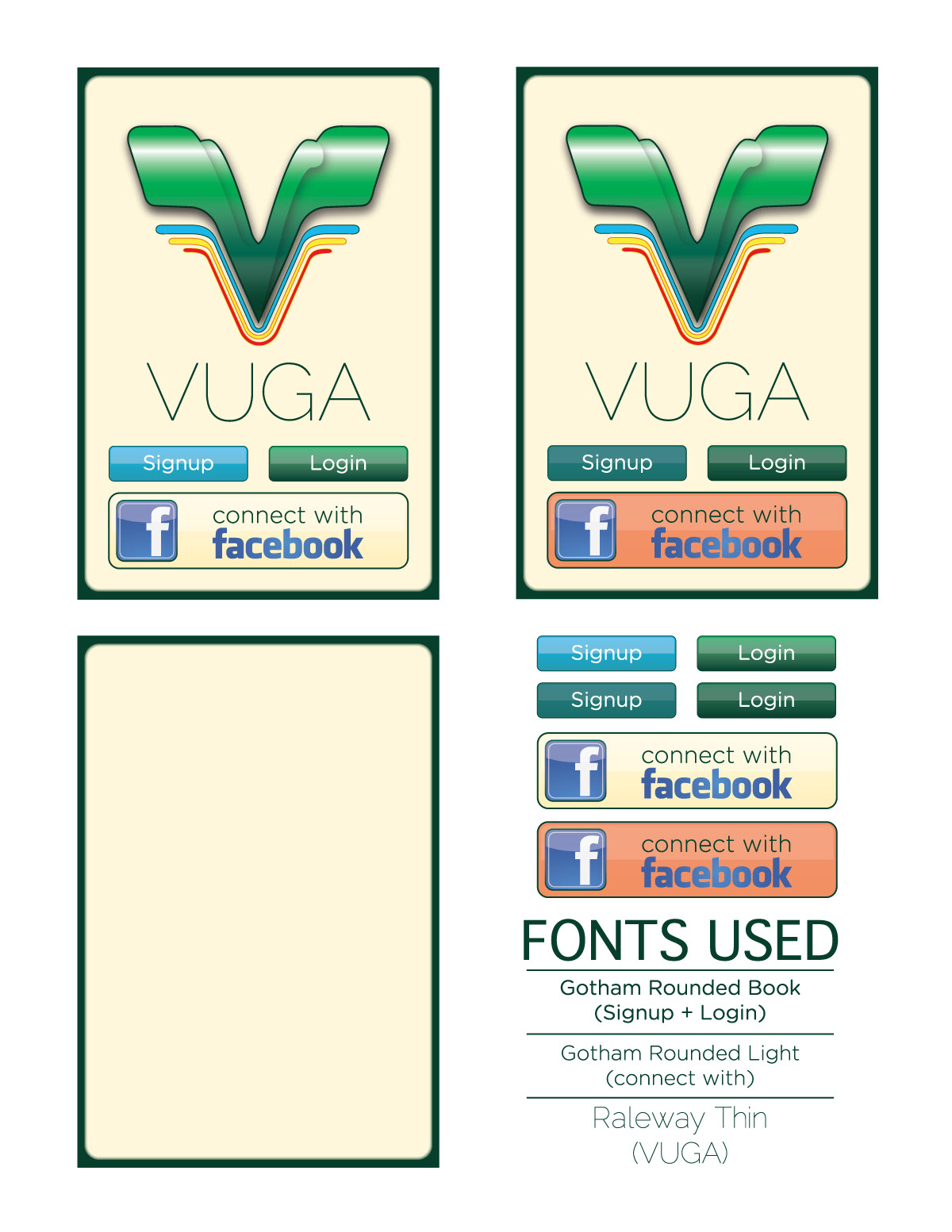
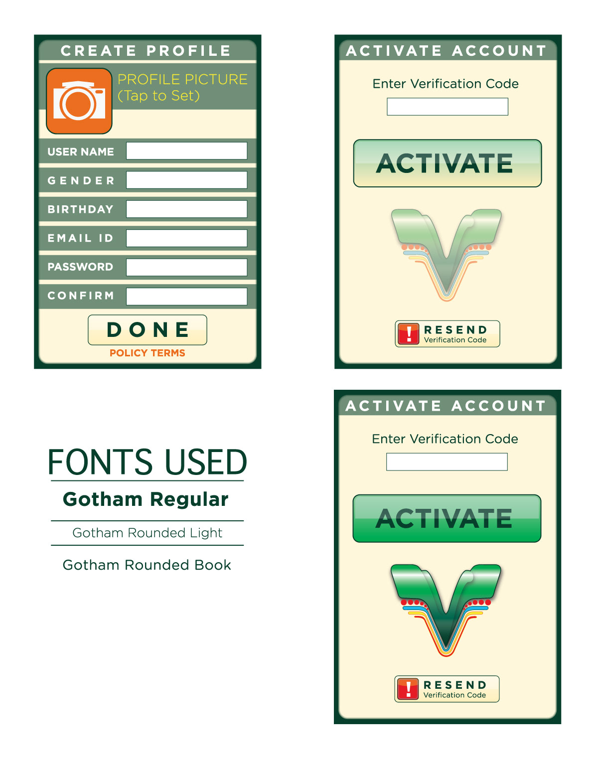
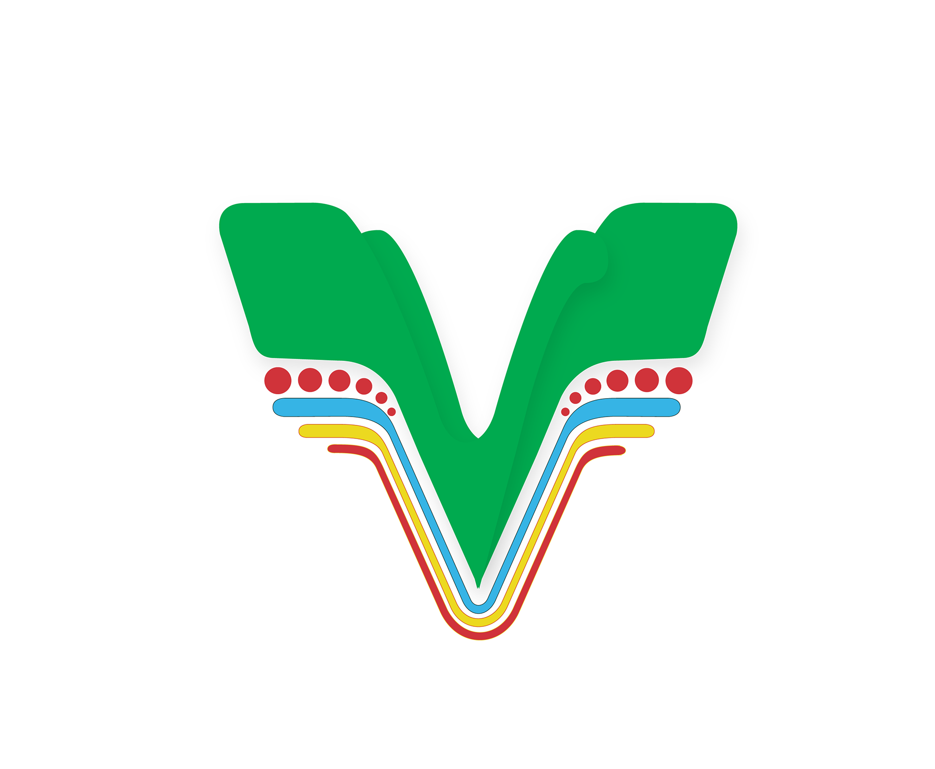
I worked closely with the UX developers as to their client needs. They client wanted the appearance and colors to utilize the Rwanda flag and its beautiful vibrant culture. Though personal research, I was made aware of their lively and vibrant culture as well as their many colorful native birds. Closer communication led them to love the idea of a colorful bird-like logo so I started coming up with sketches. Although the culture was vary bold and active, technology was not readily available everywhere. Therefore UI design needed to be playful using bold design choices and icons.
It was challenging deciding on a logo because they were presented with too many ideas. Ultimately they decided on one (even though it was not the best design choice)with some slight modifications and it led to more playful like UI design with large navigation buttons and some other UI faux-pas.
Options, options, options
Some of the many options that were presented to the client. They insisted on an outline around objects. Far too many options were presented leading to confusion and indecision. I learned a lot from this experience and carried it over to future design endeavors. Not giving too many options, but rather informing of why certain options are better, thus only presenting two or three.